The Logo
[bafg id=”2822″]
The Sundsvall Basket logo is designed to be similar to the old team’s logo, keeping the elements and colors the same. This is to help keep the brand awareness already established for years as well as to allow the reuse of expensive investments in equipment by the former club.
The new logo is assymetrical on purpose, as the old one. It is always going to be right-aligned – “moving forward”.
Wordmark

The wordmark is inspired by Sundsvall City’s history.
Not only the symbol is inspired by a historical event, it also represents the city’s passion for basketball – Always playing with fire.

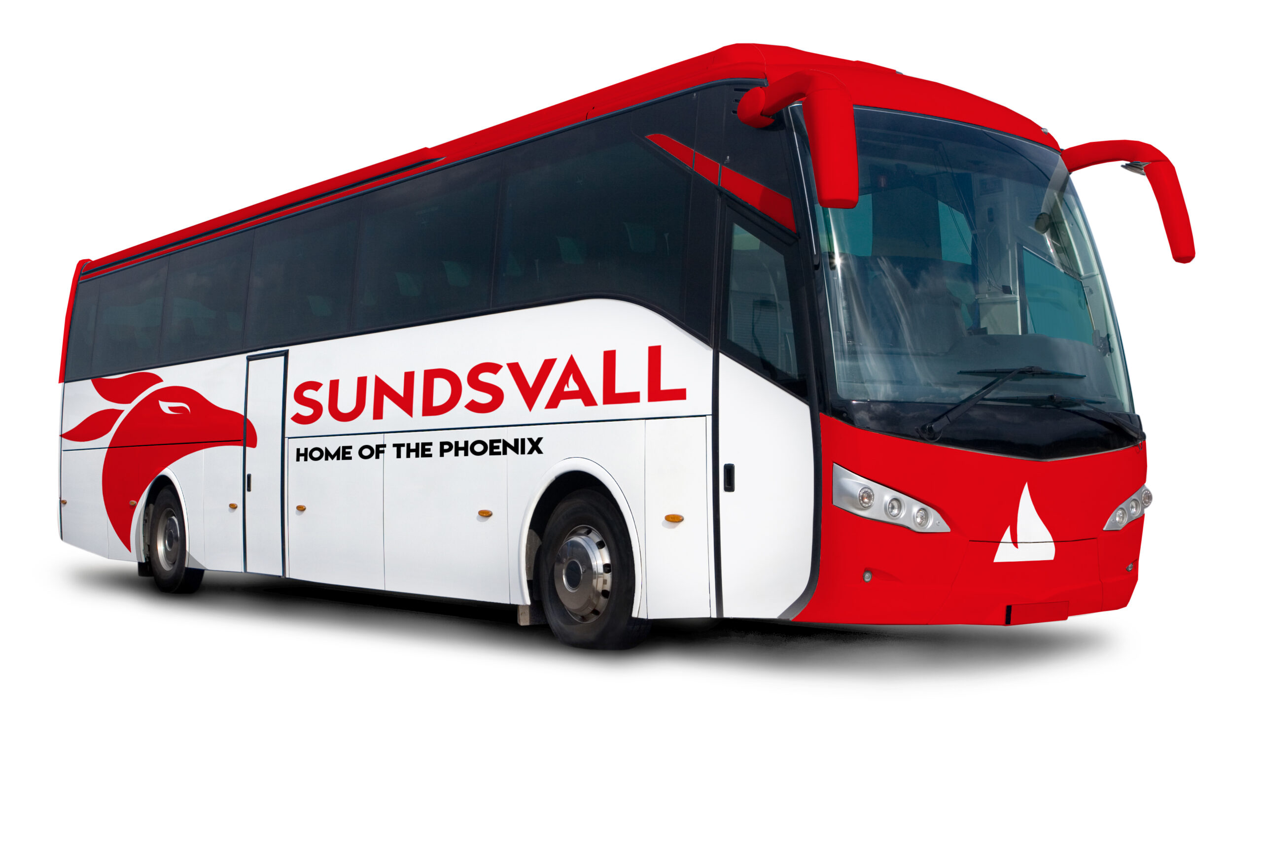
Applications


